Photoshop: Getting Into Layers
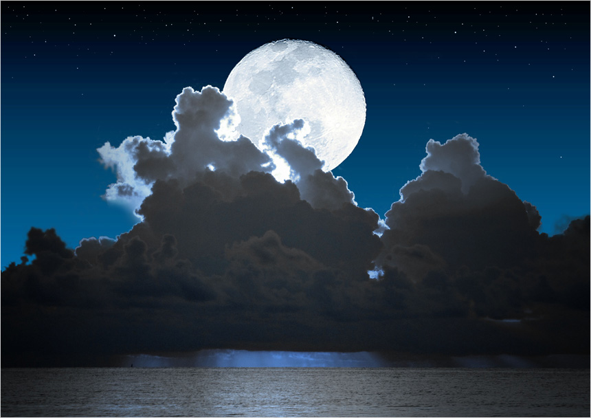
I recently wrote an article related to the Hearts project that discussed shooting the moon. I wanted a picture of a queen of spades speeding off towards the moon, but I wanted something a little more interesting than a plain old picture of the moon. I was envisioning a moonrise as a backdrop for my picture. A friend of mine is a great photographer who has shot hundreds of sunrises but not very many moonrises. I also wanted to exaggerate the size of the moon as well so I was definitely in for some creative photoshop work.
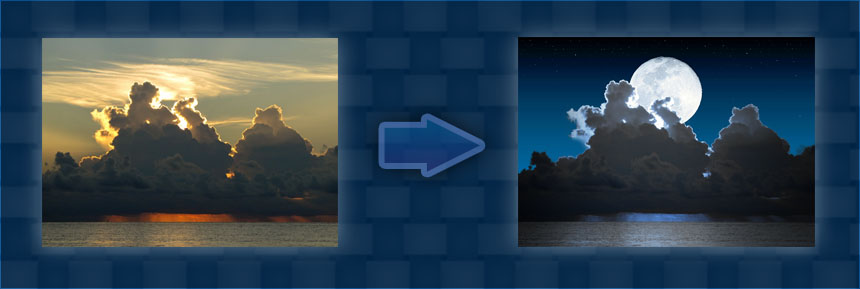
This task got me thinking about Photoshop and how it compares to the basic editing software the comes with a camera or scanner, or the iPhoto application.
There are 3 big things that come to mind to start with:
- The ability to paint pixels
- Masks
- Layers
There are a host of other features but if I had to nail down the fundamental differences it would be these 3. In this article I am going to focus on using layers to organize your work, create effects and maintain flexibility in your composition.
I remember launching Photoshop for the first time without the benefit of a book or manual or any instruction whatsoever. I could not figure out how on earth I would ever make use of the mask button and the Layer window was a huge surprise. “What am I supposed to do with that.” It is a good idea to start with a good Photoshop book and run through some tutorials just to get the ball rolling. I thought my moonrise pic was a good example of how layers become integrated into the creative process and how they not only make your work easier but amplify your creative possibilities.
The first step was to select a sunrise I knew I could work with and modify so that it would make a good moonrise. after opening the original image in Photoshop, the first thing I do is duplicate the background layer then turn off but don’t delete the background layer. Now I have a free floating layer that can be positioned at any level. Stage 1 complete. Stage 2 consisted of applying a colour overlay effect to give the scene a moonlit appearance. I experimented with various combinations of blend modes and opacity to get my desired effect.
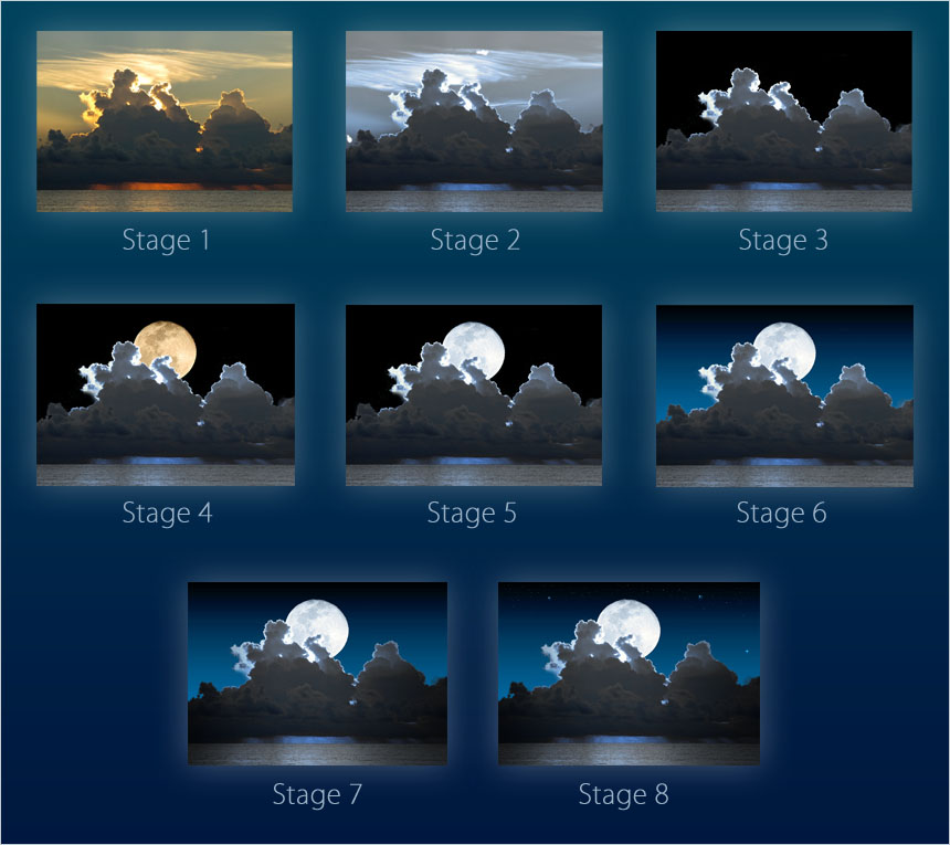
Stage 3 involved creating the mask for the clouds. When I chose the sunrise I knew I would want to eliminate all of the sky above the cloud line including the wispy cirrus clouds. Before setting to work on the mask I created a solid black fill layer under my sunrise photo layer. I knew my sky would ultimately be very dark so I added this layer first. Then as I worked on the mask I knew right away how it was going to look. (If you look at the stage 2 detail you can see a couple of white blotches that you don’t see in the sky of the original sunrise. I was accidentally painting while the layer was selected when the mask should have been selected. It didn’t matter in the end because I was masking out the entire sky anyway so I did not bother to fix it. If you ever mess up a photo layer only to discover it after you have closed and reopened the file you can always reduplicate your background layer and drag in your masks and effects from the damaged layer.)
Stage 4 was the addition of the moon. The moon image was a placed image also referred to as a smart object, so it is always rendered from the original image whenever a transformation is applied. Thinking ahead, I knew at some point my sky would have some kind of gradient applied and the solid black background of the moon pic would need to be masked out. This layer was positioned below the sunrise photo layer so that it would appear behind the clouds.
Stage 5 was the addition of another colour overlay effect that would make the moon layer fit in with the blueish effect I was after in my overall scene. I then added a levels adjustment layer to brighten up the mid tones in the moon as well as increase the overall brightness. Adjustment layers are one of my favorite tools and you can get quite creative with them.
Stage 6 was the addition of a gradient fill layer just above the solid black fill layer. The gradient was from a medium blue to transparent. Adjusting the opacity of this layer allowed me to achieve the exact amount of blue I wanted in the sky. This is much easier than using a fully opaque blue to black gradient and having to go in and edit the actual gradient in order to fine tune it.
Stage 7 involved some more subtle aspects of the work. If you look at the original sunrise and all the way up to stage 6, you can see that the clouds and the water have a somewhat uniform brightness across the width of the picture other than the more strongly reflected light in the middle. This is because daytime skies have more ambient light bouncing around which evens out the brightness of a daytime scene. At night however there is very little ambient light and an object like the moon would tend to light up the clouds and the water closer to the middle of the scene. To give this appearance I added 3 gradient fill layers. One to darken the scene on the right side, another to darken the scene on the left side and another to slightly exaggerate the reflectivity of the water in the center. The dark gradients could have been constructed as a single 3 stop gradient but I chose to keep them as separate layers for more flexibility and simpler editing. Both of those gradients were black to transparent with a multiply blending mode. The center gradient was a 3 stop transparent-white-transparent set to a hard mix blend. I masked out everything above the horizon line to limit this effect to the water.I tinkered with the opacity of these 3 layers until I achieved what I was looking for. These 3 layers were then clipped to the sunrise photo layer so they would not affect the sky or the moon.
Stage 8 was the addition of the star layer. Your first thought might be to just create a new layer and start painting in stars. As an alternative that offered more flexibility I created a light blue solid fill layer, then masked it out entirely. Then I painted out the mask where I wanted the stars to appear. Now if I wanted to change the star colour I could just adjust the fill colour. If I painted the pixels directly into the layer I would have had to use an overlay effect or an adjustment layer to tweak the star colour. In addition I could have created multiple star layers with different fill colours for multi-coloured stars.
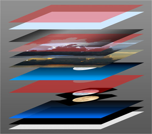
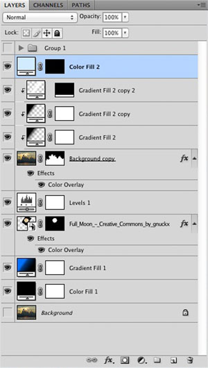
It is important to take advantage of the flexibility that layers offer. Make sure you choose the optimum blending mode and opacity setting. Remember that you can create clipping masks so that the layer’s bounds are limited to the layer below that they are clipped to. Your ultimate goal should be to create works that are easier to quickly alter and experiment with, and allow for broader avenues of creativity.
