Mobile Sites: Responsive Design
Many people have existing websites that they would like to have updated so that they display nicely on mobile devices. Generally speaking, most tablets can display any website quite well. There are odd exceptions, often with older websites that have 760 pixel or other narrow layout widths. You end up with wasted space or device prompts asking for viewing options. Phones on the other hand make it difficult to view a standard website layout. You have to zoom in to the page and then swipe around to see all the page content.
In the early days of mobile site layouts I would put the mobile site on a subdomain or in a subfolder. Using server-side device detection the user would be redirected to the mobile or desktop site depending on the device.
When building a brand new website with a responsive design in mind the task can be fairly straight forward and with frameworks like Bootstrap sites can be laid out with a mobile first approach without the need of server-side device detection.
In the case where we want to update an older site so that it is mobile friendly it can become more complicated. If the site was built in such a way that a responsive design can be achieved by adding additional HTML and CSS it may be feasible to use the existing code. If it becomes necessary to perform a lot of modifications on the original HTML and CSS it may be more practical to consider redesigning the site. Especially now that Google factors in the mobile friendliness of a site in its search rankings.
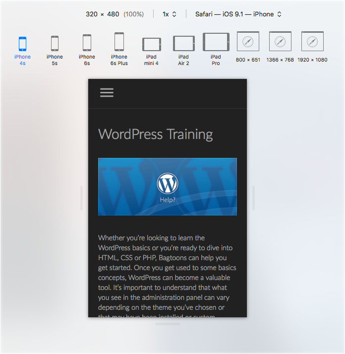
The big difference in the end result is the transformation to a single column layout on mobile devices with easily readable font sizes and full width images. It is also usually necessary to change the menu system to a single column with expandable panes instead of dropdowns as well as making the entire menu expandable / collapsable.
